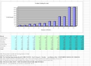
The First Graph is an aggressive Trading Goal. Obviously not a trading plan, as I have put no details of money management or entry and exits. Primarily it's for patient play, to sit in front of your computer until you see a trade that is so obvious. Because it is only looking for a few ticks it's time range is one day. But with decent trading platform and size it could be every two hours !
The second Graph is from an actual trading period, one of my better one's despite two very large drawdowns. My starting capital was actually £2,600 then topped up to £3,350.00. Midway through after my second big draw down I put £8,000 back in. Ones focus should be on the P&L per day and the number of trades carried out. I find it interesting to go over these and figure, what short of market was I trading in! What have been my natural highs or low's what barriers are existing in my mind. An obvious one is reaching £100,000. What you should notice is how my actual trading follows the first Graph, in terms of doubling my account size, up and till my huge drawdown, I managed to double my account on average every seven days. This was done through increasing my size as my account grew. At sum point ( mine was £200,000) one should reduce their size substantially and this is what preserves your account. at my peak I was trading £750.00 a tick, if I had of switched to £100 or even better £50.00 per tick this would have preserved my capital. Like a rocket, the most difficult part is the lifting of the account into the major positive zone before coasting towards the stars.
Past Performance Trading Stat


No comments:
Post a Comment